Insights
Turning Complex Data Into Meaningful Stories

Introduction & Objective
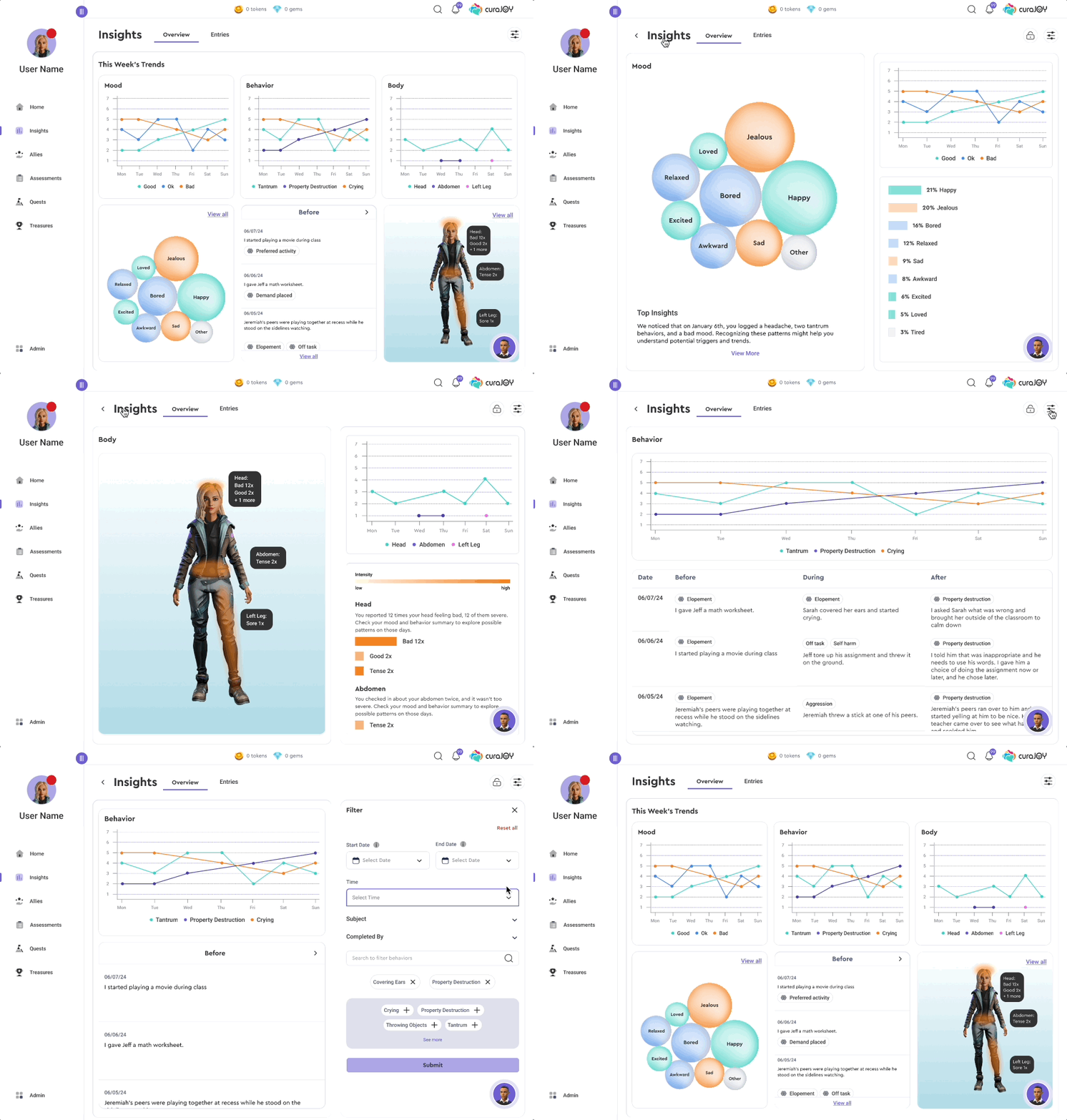
CuraJOY is a nonprofit tech company focused on making mental health support more accessible through gamification and AI-driven tools. The Insights Page is a new feature that brings together user-submitted data (mood, body, and behavior check-ins) into one centralized and visually engaging view.
My Role
UX Designer
Context
2-week Design Sprint
2 UX Designers + Developers + CEO
Outcome
Fixing bugs in Dev Mode
Ready for Testing
Discover
Discovery
Users were regularly submitting mood, body, and behavior check-ins—but had no way to view their progress, spot patterns, or draw insights.
Each data type was unique:
Mood: Simple 3-point scale (good, okay, bad)
Body: Pain levels across different body parts
Behavior: ABC model (Antecedent, Behavior, Consequence), requiring event sequencing
Research
The Challenge: Display complex, varied data types in a single place without overwhelming users
Conducted user interviews with families and agents to understand how they interpret this data.
Aligned with stakeholders (e.g., behavioral experts and BCBAs) to ensure the data was clinically useful and meaningful.
“Can we pinpoint if certain behaviors are linked to specific physical complaints?”

“I want to know if there’s a pattern in my child’s mood over time”
Design
Iterations
We explored a wide range of iterations to find the right way to visualize this data—it was a hands-on lesson in data visualization best practices, balancing clarity, emotional resonance, and what actually worked for our users. Our Figma workboard became a living archive of everything we tested, refined, and learned along the way.
Mood
Behavior
Figma board showing competitive audit of other mental health tools and some initial wireframes
One of the toughest design challenges was figuring out how to visualize mood trends in a way that felt both emotionally resonant and clear. Early iterations included bar charts and line graphs, but they didn’t quite capture the nuance or variety of emotions people reported.
We eventually landed on a bubble chart that groups emotions by type and frequency. This not only made the visualization playful and approachable, but also allowed users to quickly spot dominant patterns (e.g., "Happy" and "Jealous" being most frequent this week).
To complement this, we added a simple trend line showing mood ratings over the week for a quick temporal snapshot
Body
For body-related check-ins, we explored static charts but realized users needed something more spatial. We designed an interactive body map (similar to the way body check-ins are done) where pain levels are color-coded and plotted over time—allowing users (or agents) to spot chronic pain patterns and relate them to mood or behavior.
The ABC (antecedent-behavior-consequence) model requires sequence clarity.
We created chronological cards that visualize sequences from trigger to outcome. Users can filter by specific behaviors or triggers to look for patterns, they are also able to quickly see behavior labels in chips
Filter
To support exploration, we added a filter system that lets users sort by:
Time range
Emotion for mood
Body part or pain level
Behavior type (for this example to the right)
This gave the page power and personalization without overwhelming the core experience.
One of the earlier iterations
‘View all’ screen
‘View all’ screen showing intensity by a darker color
Deliver
Build, Align, and Prepare to Test
Worked closely with developers to bring data visualizations to life using existing components from our design system
Ensured the experience was scalable for future data types and accessible across devices by starting mobile first
Added new accessible components to design system after discussing with dev team
We’re currently preparing for usability testing to validate:
Can users identify key patterns in their data?
Do they find the visuals approachable and easy to understand?
Does the page build emotional awareness rather than stress?
Impact & Reflections

This project stretched my skills in information design and data storytelling.
I learned how to:
Translate complex data into digestible insights
Balance clinical accuracy with user empathy
Champion user needs across a cross-functional team
And was reminded at its core, great information design makes the complex feel simple and the abstract feel personal—it bridges data and human experience in meaningful ways