CuraJOY
Enhancing Mental Health Journeys: Redesigning the Quest Feature with Data Visualization to Drive Engagement
Introduction & Objective
CuraJOY is a nonprofit tech company focused on making mental health support more accessible through gamification and AI-driven tools. I was brought in to design the Quest pages, where users complete activities to build positive habits. While the structure was in place, key design challenges remained—engagement was low, progress tracking lacked clarity, and the experience didn’t fully motivate users. My role was to refine the interface, improve data visualization, and create a more intuitive, visually engaging experience that keeps users motivated to continue their mental wellness journey.
My Role
UX/UI Designer
Context
2-week Design Sprint
2 UX Designers + Developers + CEO
Outcome
Currently in development
Next release 3/10/25
Discovery
Designing with Existing Structures
The website had an established structure and design system, and the Quest framework was already conceptualized by the time I joined the project.
The goal of this feature is to create an engaging and visually appealing experience that keeps users motivated to continue their quests and progress toward their behavioral health goals.
Previous Design Issues:
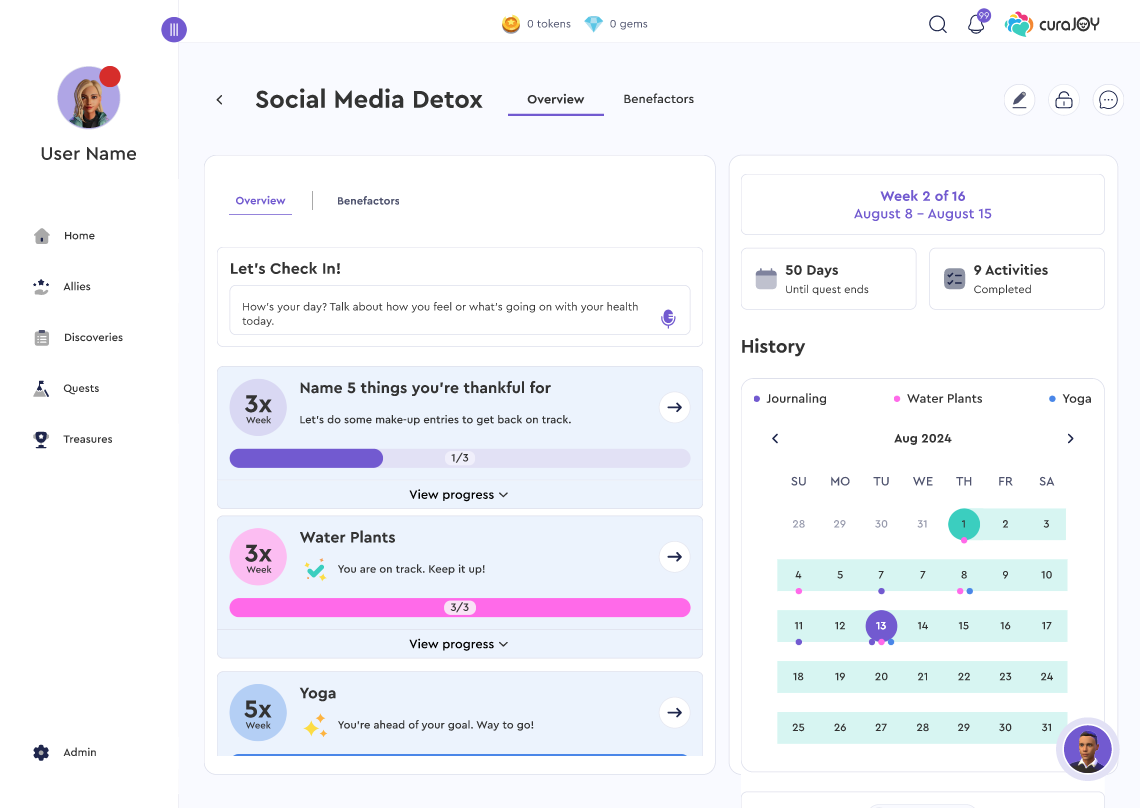
Unclear Data Measurement – It wasn’t clear how user progress was being tracked or measured which we felt would lead to a lack of engagement, when you see you’re progress laid out clearly, its much more exciting to keep going!
Limited Calendar Insights – The calendar only displayed completed or incomplete tasks without specifying which activities were completed. It takes up so much real estate for such limited information.
Cumbersome Check-In Process – Users had to navigate to a separate page to log activities, adding unnecessary clicks that could reduce engagement.
Blog Section Overload – While blog posts were important to the CEO for fostering user interaction, they occupied too much space.
Design & Test
Visualizing Progress
Issue 1 & 2 - Unclear Data & Limited Calendar Insights- with the current site was how the data is visualized. There was no clear distinction between ferquency and accuracy of completing activities.
Iteration 1
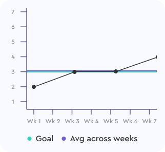
We added a graph that would replace the calendar to show frequency.. but we were still missing accuracy.
Desktop (click for bigger view)
Tracking Progress
Engaging with Results
Mobile (click for bigger view)


Issue 3: Activity Check-In Process – Previously, users had to navigate to a separate page to log their activity, creating unnecessary friction. To streamline this, we implemented a modal, allowing users to check in without leaving the quest page. By reducing clicks and keeping everything in one place, we anticipate increased engagement and a smoother user experience.
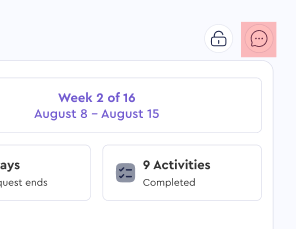
Issue 4: Blog Placement & Engagement – We wanted the blog to feel like a true social hub, we created a dedicated landing page accessible via the "message" icon in the top right. This redesign gives the blog room to breathe, making it a more inviting space for users to share, comment, and interact. By transforming it into a dynamic and engaging feature, we anticipate increased user interaction and time spent on the platform
Iteration 2
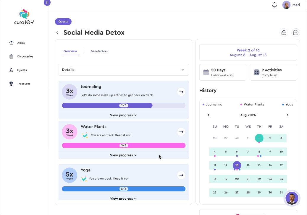
In our next iteration, we used the calendar to visualize activity frequency with colored dots indicating whether a user completed an activity on a given day. To provide deeper insights, we placed the progress graph within a dropdown, displaying a goal line alongside the user’s actual progress, allowing users to easily assess their performance and identify areas for improvement. Additionally, we redesigned the icon to display more relevant data instead of using a default icon, maximizing space and ensuring that key information was easily accessible at a glance.
With this dedicated space, we anticipate increased user participation, making journaling and community interactions a more integral part of the platform.
Users will be able to see comments and reply making the platform more engaging.
We conducted unmoderated prototype testing with 10 users, aged 18–35, who valued mental health and had prior experience with habit trackers.
Objectives:
Assess ease of logging activities
Test navigation flow to posts/comments section
Measure overall impressions and emotional engagement
“It feels like I’m actually making progress toward something. The visuals and encouraging messages really help me want to keep going.”
Key Findings Posts Section:
⚠️ 70% struggled to locate the posts/comments section—many expected it under “Details” or “View Progress”
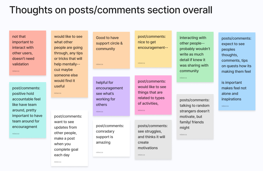
To the right are some overall thoughts about the post section
Testing
Key Findings Usability:
✅ 90% of users easily logged activities and appreciated the single-screen check-in flow.
💬 Positive emotional feedback: Users frequently used words like motivated, calm, supported, excited
Frequency
Accuracy with goal line
Final Solution & Thoughts
Reflections
Current iteration:
Based on the research and some current design system tweaking, we are working on adding the posts as a tab and allowing users to create new posts .
Redesigning the Quest experience showed me the power of collaboration in creating meaningful user experiences. Working with developers led to smart solutions—like three-dot indicators for a cleaner calendar—and conversations with the CEO helped us prioritize features that foster community. Team feedback ensured we balanced user needs with business goals.
The new experience is more intuitive, motivating, and emotionally rewarding. Users can now track progress, recognize behavior patterns, and connect with others. I’m excited to see how our work impacts engagement and to keep learning from real-world feedback.